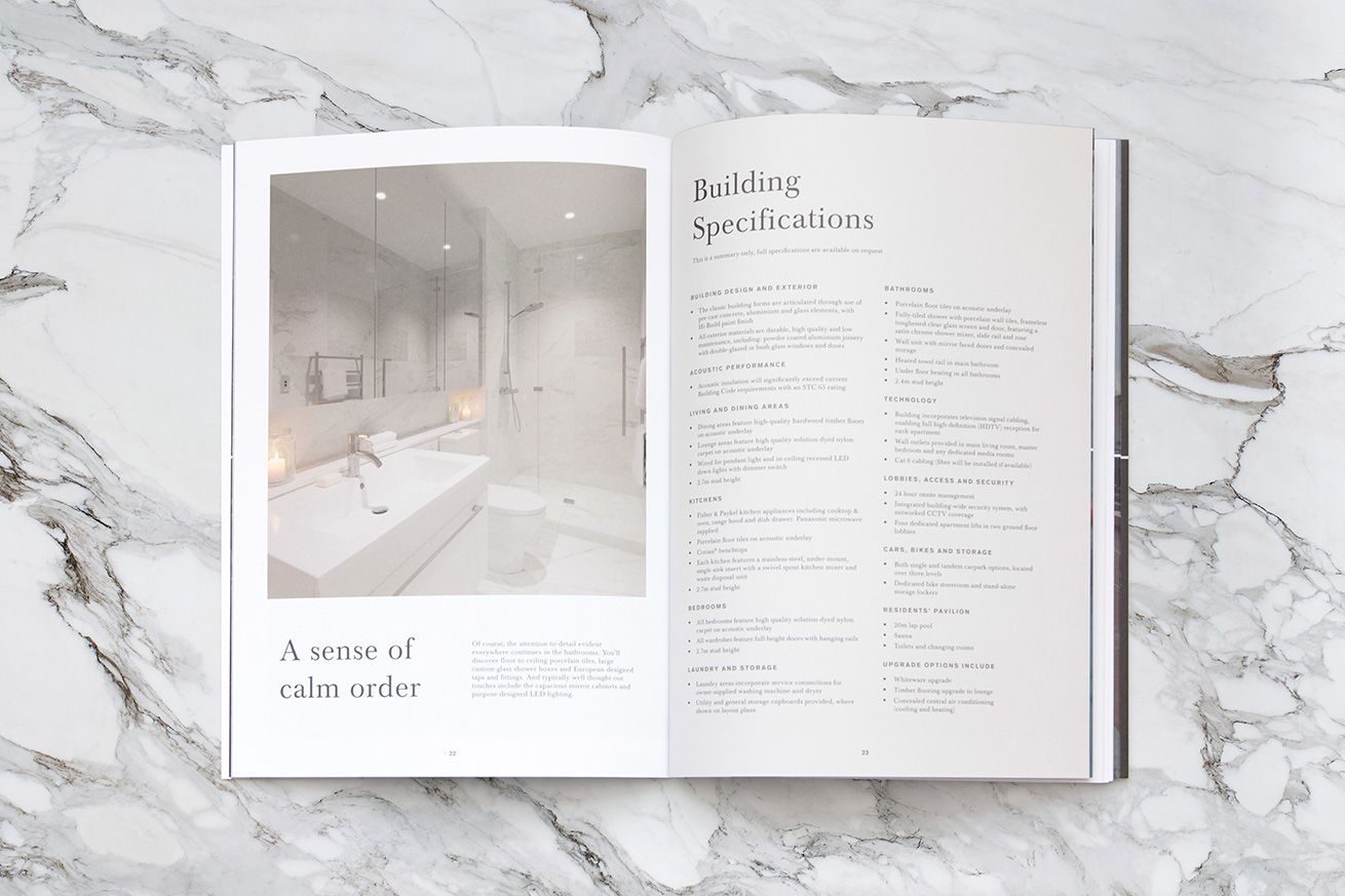
The Antipodean Apartments Branding
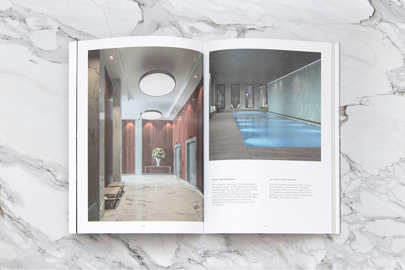
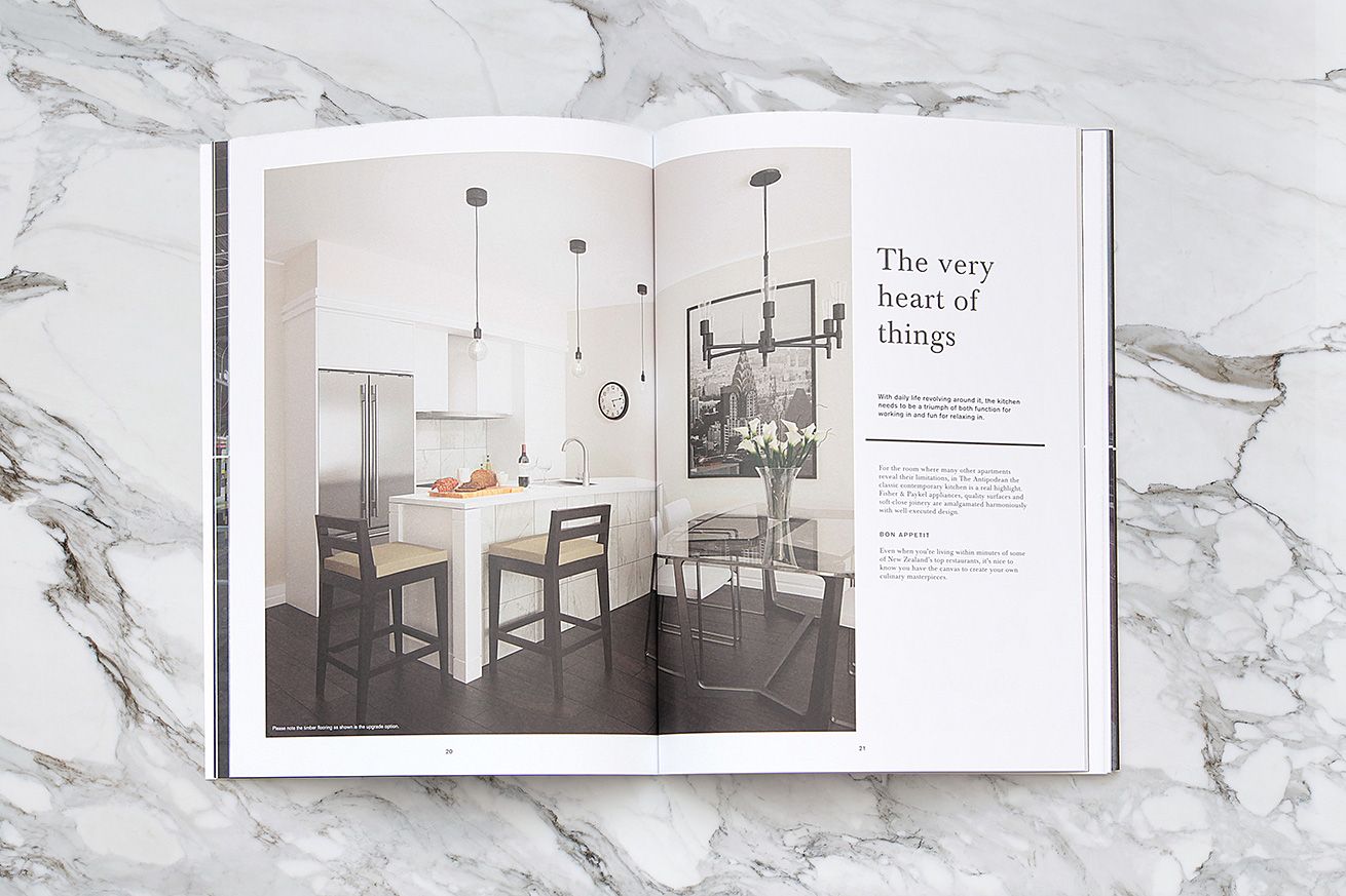
The Antipodean is an exquisite apartment building within a short walk of all Auckland’s Downtown precinct attractions and amenities.
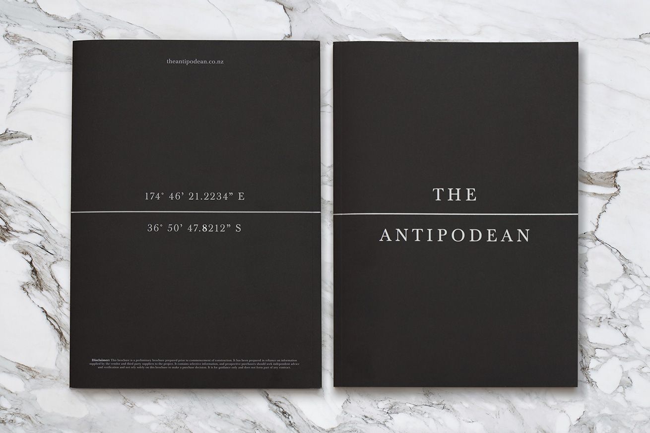
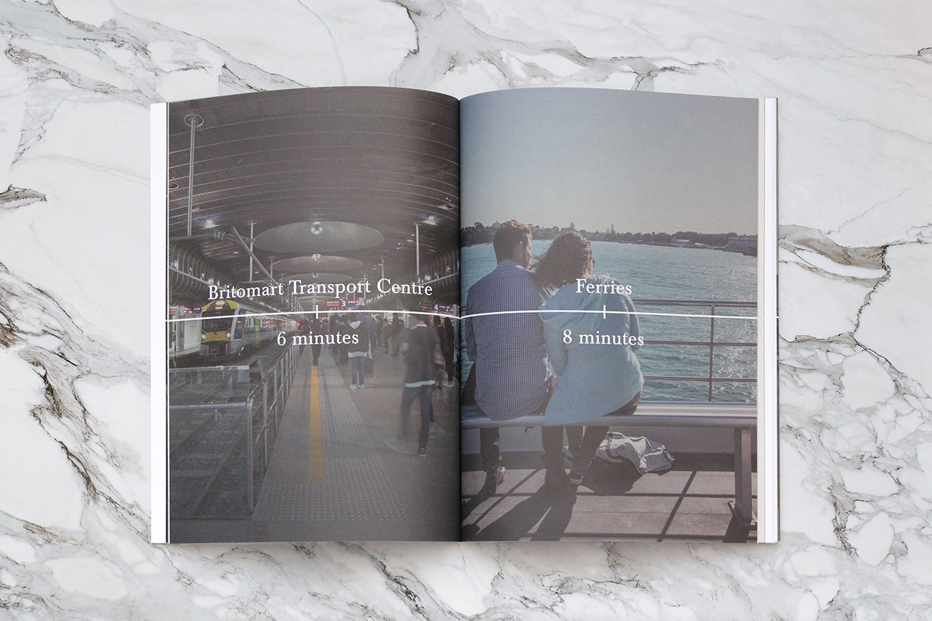
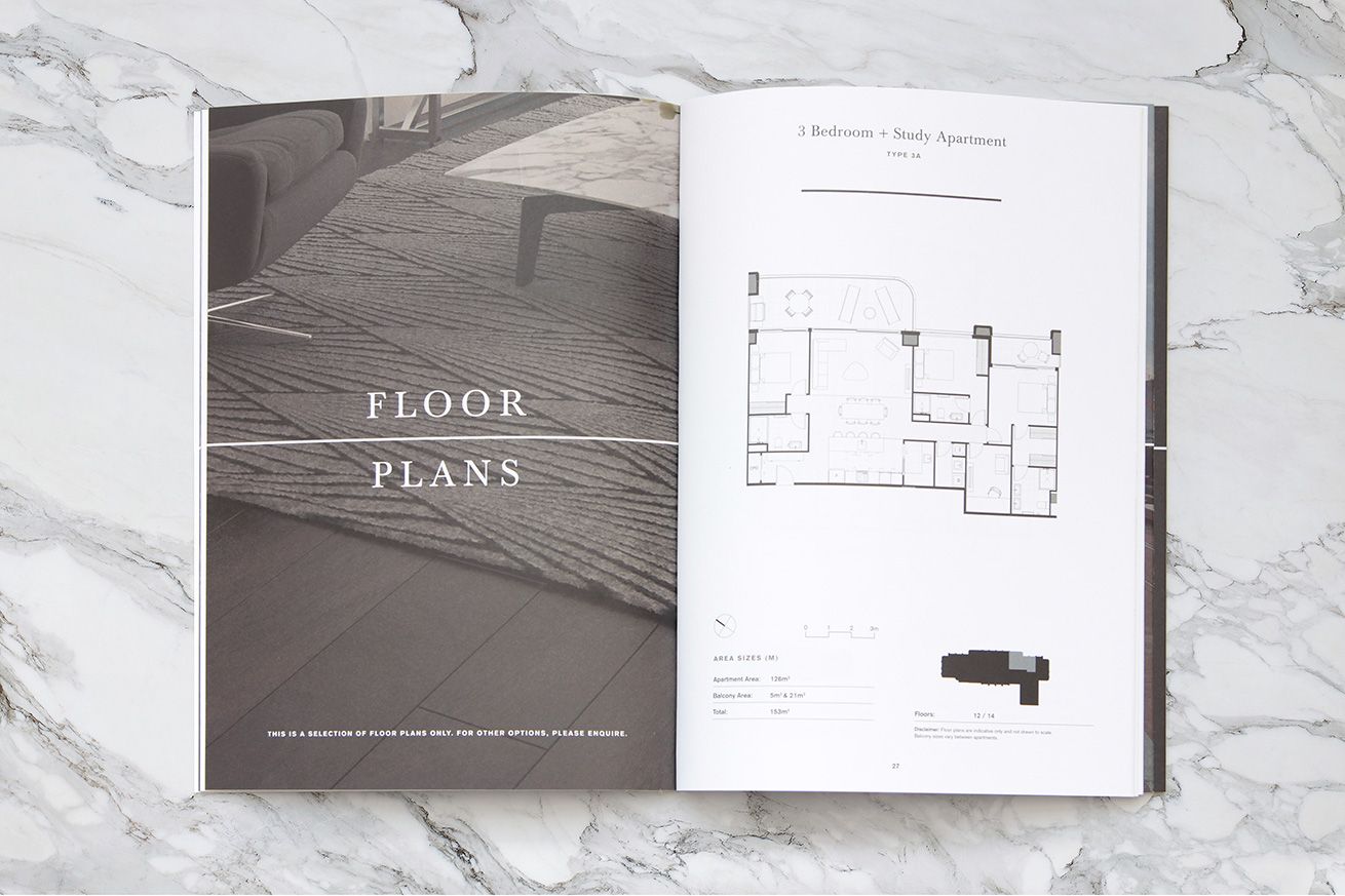
The simple unifying idea a strong linear device — representing the equator — that runs through the logo and is used elsewhere as a timeline to communicate the proximity to all that the area has to offer. Applied across the development’s printed collateral, website, touchscreens etc, the concept has helped the developer sell 50 apartments in just the first 6 weeks of listing.

A Best Awards Winner.
